“Make us look like a real company,” is what the President of this upstart telecom firm asked me to do. So I created a brand identity to solve the company’s communications challenges.
A little backstory
The company owner is a retired Southwestern Bell executive. The phone biz was in his blood. After starting this new company in 1995, growth happened without a logo, advertising or even formal marketing material. This is because he’s a consummate salesman who knows anyone who’s anyone in the telecom industry.
![]()
The story of the logo starts with the name
After interviewing employees and speaking with existing customers, it became clear a primary communications issue is the company name “Telenetwork.”
Employees described how partners, vendors, prospects, and customers have difficulty with name recall. Even long-time clients refer to the company as “Telework,” “Telenet” or “Network-something.”

“Telenetwork” is a long name—four syllables—and it’s a made-up word, which can be difficult to remember. If friends of the owner have a problem remembering it, how can we expect a wider audience of prospects to do any better?
Solving the problem
The solution for the logo depends on making the name easier to recall. I made it easier to remember the name by changing the capitalization. The initial “T” is now lowercase, and the middle “n” is now capitalized.

This unusual capitalization makes the company name more memorable by adding visual cues that break the name into chunks that highlight the component word parts “tele” and “network.” In both the logotype, and in written communications, the revised name “teleNetwork” improved name recall.
This little logo goes to market
teleNetwork was one of the pioneering competitive local exchange carriers (CLECs) to compete with Southwestern Bell in providing phone service in Texas.
After deregulation in the telecommunications industry, CLECs emerged to provide competition to the behemoth, established incumbent local exchange carriers (ILECs) otherwise known as the Baby Bells.
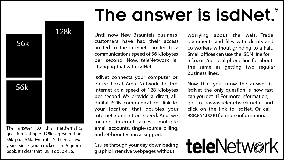
I researched the new market opportunity and created products that leveraged teleNetwork’s unique capabilities as a CLEC and ISP.
Research showed that consumers are overwhelmed with the newly deregulated telecom market. Yes, more choice is good. Lowered prices are good. But many people are annoyed at having to look at a multitude of companies for long distance, internet and now basic telephone service.

The solution is simplicity
The product I designed takes the hassle out of phone and internet service by providing a single, simple choice for consumers.
“Uno” is an all-in-one telephone, long distance, and internet service. Rolled out in 1997, it was the first of its kind in the United States.
The product name speaks to the unified package of telecom services. The logo carries the “radiance signature” theme from the teleNetwork logomark to the product level.
Where are they now?
Over the last two decades, teleNetwork has evolved from a provider of outsourced tech support into an ISP, then a CLEC, and now a diversified contact center delivering business process outsourcing services to Fortune 500 companies.


