Making beer fun again
Tired of homogeneous “big beer” companies, Americans rekindled their love affair with small-batch, microbrew beers in the 1970s. One of the microbrews most admired by beer connoisseurs is Pete’s Wicked Ale. Now Pete’s Wicked Ale is part of the Gambrinus Company and joins their portfolio of brands including Corona, Mordelo, Shiner, and Moosehead.
The need to refine the brand image
After purchasing the Pete’s Brewing Company, Gambrinus extended the Pete’s Brand by introducing a number of new seasonal and other beer products. By 2003, the packaging design for the Pete’s family of products was inconsistent and lacked a coherent brand identity. I was engaged to refine the brand identity and line-look for the Pete’s family of beers.
Taking care of a cult classic
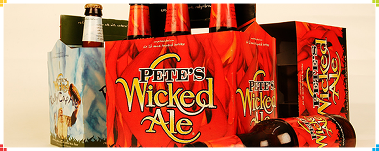
Each of the beer products had unique challenges. Pete’s Wicked Ale, the flagship of the family, has a loyal—if not cult-like—following. Any changes to its look had to embody the core attributes of a cool, fun, and “out of the ordinary experience” for Pete’s consumers. I created a set of flames to play up the “wicked” aspect of the brand and increase appeal to the primary demographic of 24 to 35-year-old males.
A wicked good label
The bold red flames made the new Pete’s Wicked Ale packaging stand out on shelves and increased point-of-purchase appeal. The redesigned packaging also provided a coherent line-look and helped raise awareness of the full Pete’s family of products. After the new packaging hit the shelves, a sales slump turned into an increase of four percent, and laid the foundation for Gambrinus to further extend this venerable line with other seasonal beer products.